Data Gathering
For this project, data was collected by using APIs from Spotify Web API and NewsAPI, and downloading the data from other websites.
Spotify Web API
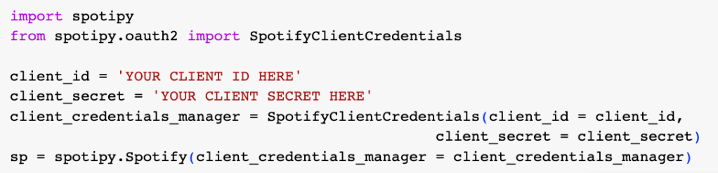
Before gathering data, getting client credentials to the Spotify API is a must. The first thing to do is to go over to the Spotify Developers page and then create an app. This is an important step because Client ID and Client Secret are the keys to accessing Spotify’s endpoints. Once getting the Client ID and Client Secret, coding is the next step to do.
Step 1: Install Spotipy

Step 2: Import and Set Up Spotipy
Using the Client ID and Client Secret to start querying the API’s endpoints
Step 3: Gather the data
There are a few limitations to the search endpoint.
limit: a maximum of 50 results can be returned per query
offset: it is the index of the first result to return, for example, if you want to get the results with the index 50-100, you will need to set the offset to 50.
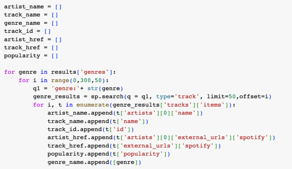
And then create the dataframe for the step above and make Spotify API requests to return audio features.

Step 4: Merge data into one dataframe
The dataset contains 24,866 rows and 18 columns.
NewsAPI
The goal of getting data from NewsAPI is to see how music affects people in positive or negative ways. The API key needs to be established by registering an account.
Step 1: Enter the API key and endpoint

Step 2: Gather the data
Before running the query below, the list of topics was created by the topics which are focused on. The topics focused are pop music, rock music, hip hop, rhythm and blues, country music, electronic music, disco music, and k-pop.
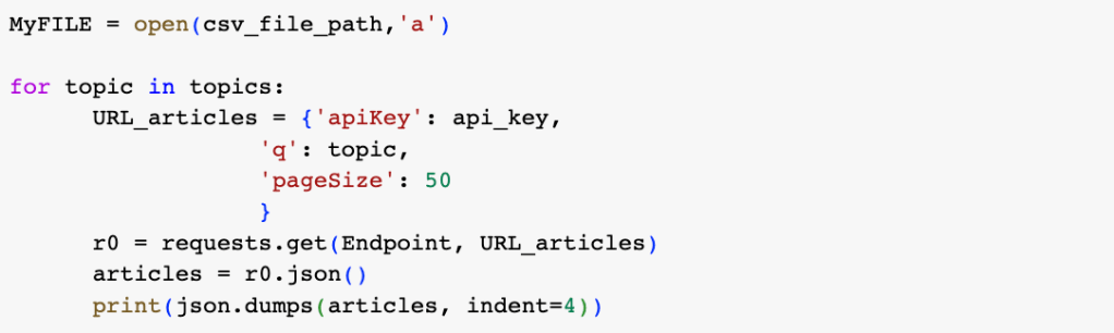
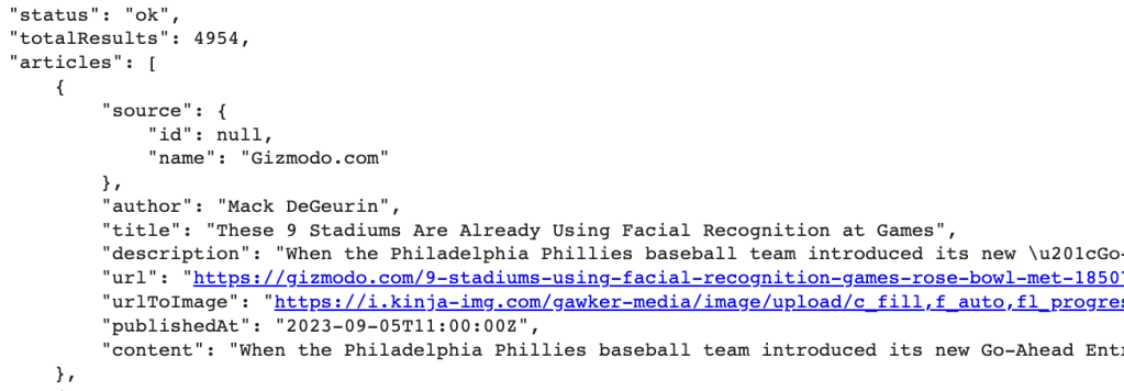
Here is an example of the data from the API in JSON format.
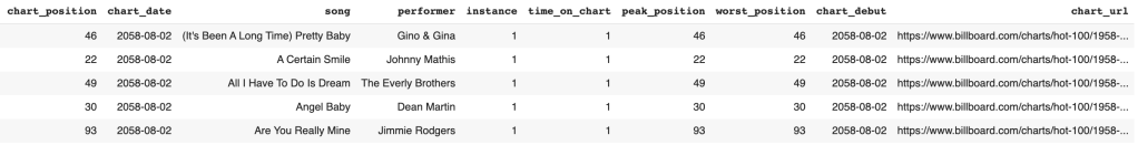
Billboard Chart Data
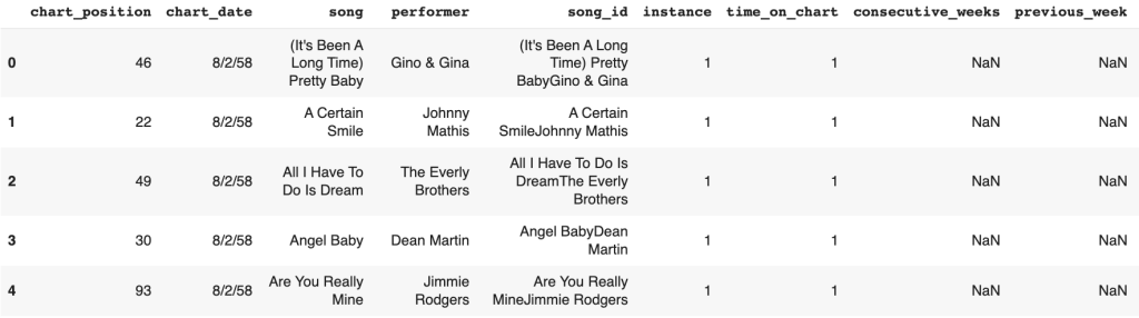
In order to analyze hit songs, Billboard Chart could be an indicator of the songs to see if they are on the chart. The data was collected from Data.world. It contains every weekly Billboard hot chart since 1958 with 338,395 columns and 13 rows. An example of the data gathered shows below.
Data Preparation
The process of making raw data ready for further processing and analysis is known as data preparation. In order for machine learning algorithms to work properly, raw data must be collected, cleaned, and labeled before being explored and visually represented.
Spotify Data
The dataset collected is mostly cleaned. There are no missing values found in this dataset. However, some columns were removed since they were not necessary to be used for analysis.
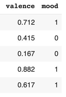
The mood column was created from the valence column. Valence is a measure from 0.0 to 1.0 describing the musical positiveness conveyed by a track. Tracks with high valence sound more positive such as happy and cheerful. However, tracks with low valence sound more negative such as sad and angry. Thus, in the mood column, 1 refers to positive feelings and 0 refers to negative feelings.
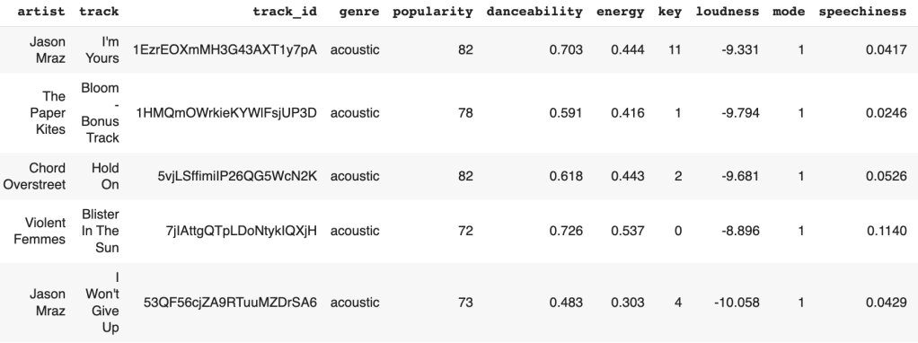
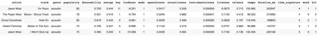
In order to identify which songs are popular, the hit column was created by pairing Spotify data with the Billboard data. If the song is in the Billboard data, 1 will be labeled in the hit column, but if the song is not in the Billboard data, 0 will be labeled. The data after cleaning and labeling is shown below.
Data Dictionary
- artist: Song Artist
- track: Song Name
- genre: Song Genre
- popularity: Song popularity on a scale of 0 to 100 where a higher number means more popular
- danceability: Danceability describes how suitable a track is for dancing based on a combination of musical elements including tempo, rhythm stability, beat strength, and overall regularity. A value of 0.0 is the least danceable and 1.0 is the most danceable.
- energy: Energy is a measure from 0.0 to 1.0 and represents a perceptual measure of intensity and activity. Typically, energetic tracks feel fast, loud, and noisy. For example, death metal has high energy, while a Bach prelude scores low on the scale. Perceptual features contributing to this attribute include dynamic range, perceived loudness, timbre, onset rate, and general entropy.
- key: The estimated overall key of the track. Integers map to pitches using standard Pitch Class notation. E.g. 0 = C, 1 = C♯/D♭, 2 = D, and so on. If no key was detected, the value is -1.
- loudness: The overall loudness of a track in decibels (dB). Loudness values are averaged across the entire track and are useful for comparing the relative loudness of tracks. Loudness is the quality of a sound that is the primary psychological correlate of physical strength (amplitude). Values typically range between -60 and 0 db.
- mode: Mode indicates the modality (major or minor) of a track, the type of scale from which its melodic content is derived. Major is represented by 1 and minor is 0.
- speechiness: Speechiness detects the presence of spoken words in a track. The more exclusively speech-like the recording (e.g. talk show, audiobook, poetry), the closer to 1.0 the attribute value. Values above 0.66 describe tracks that are probably made entirely of spoken words. Values between 0.33 and 0.66 describe tracks that may contain both music and speech, either in sections or layered, including such cases as rap music. Values below 0.33 most likely represent music and other non-speech-like tracks.
- acousticness: A confidence measure from 0.0 to 1.0 of whether the track is acoustic. 1.0 represents high confidence the track is acoustic.
- instrumentalness: Predicts whether a track contains no vocals. “Ooh” and “aah” sounds are treated as instrumental in this context. Rap or spoken word tracks are clearly “vocal”. The closer the instrumentalness value is to 1.0, the greater the likelihood the track contains no vocal content. Values above 0.5 are intended to represent instrumental tracks, but confidence is higher as the value approaches 1.0.
- liveness: Detects the presence of an audience in the recording. Higher liveness values represent an increased probability that the track was performed live. A value above 0.8 provides a strong likelihood that the track is live.
- valence: A measure from 0.0 to 1.0 describing the musical positiveness conveyed by a track. Tracks with high valence sound more positive (e.g. happy, cheerful, euphoric), while tracks with low valence sound more negative (e.g. sad, depressed, angry).
- tempo: The overall estimated tempo of a track in beats per minute (BPM). In musical terminology, tempo is the speed or pace of a given piece and derives directly from the average beat duration.
- duration_ms: Duration of song in milliseconds
- time_signature: The time signature (meter) is a notational convention to specify how many beats are in each bar (or measure). The time signature ranges from 3 to 7 indicating time signatures of “3/4”, to “7/4”.
- mood: it indicates the mood of the song. 1 is a positive feeling and 0 is a negative feeling.
- hit: A measurement to indicate if the song is on the Billboard Chart. 1 is yes and 0 is no.
Billboard Data
This billboard dataset is mostly cleaned. For preparing the Billboard data, some columns were removed since they were not necessary to be used for analysis. That is the only step that has to be done with this dataset. So that the data needed can be ready to be analyzed and created visualizations for the next step. The figure below is an example of the data after cleaning.
Data Dictionary
- chart_position: the position of the song for the given chart date
- chart_date: the date that the chart was released
- song: song name
- performer: artist
- instance: this indicates how many times a song as returned to the chart after more than 1 week off the chart (See Mariah Carey – All I Want for Christmas is You for an example)
- time_on_chart: this is the running count of weeks (all-time) a song has been on the chart
- peak_position: Indicates the all-time best/peak position for a song_id
- worst_position: Indicates the all-time worst/lowest position for a song_id
- chart_debut: The date of the first initial instance for a song_id
- chart_url: This URL will take you to the chart on Billboard.com
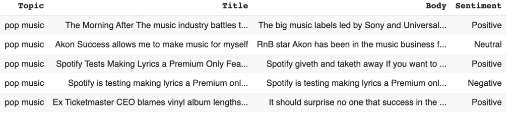
NewsAPI Data
To begin with, the dataset collected is textual data, so the cleaning steps in natural language processing (NLP) is an important step. First of all, create a function to standardize the text data by making it all lowercase. This can be useful for various text analysis tasks, such as text classification, sentiment analysis, or information retrieval, where case sensitivity might not be relevant. Second of all, remove all numeric digits from a given text string. Next, remove punctuation characters from a given text string. This step can be helpful in various natural language processing (NLP) tasks to simplify text and reduce noise, making it easier to analyze or process the text. Then, extra whitespaces must be removed, including spaces, tabs, and line breaks.
After that, create a function to remove common stopwords from a given text. The purpose of this function is to preprocess text data by removing common words (stopwords) that often do not contribute much information in natural language processing tasks. Stopwords are words like “the,” “and,” “in,” “is,” etc., which are common in English but are often removed to focus on the more meaningful words in the text. Therefore, lemmatized words can be created. Lemmatization is the process of reducing words to their base or dictionary form (lemma) to normalize them for analysis. This process is useful for preprocessing text data when you want to reduce words to their base forms to improve the consistency of the text for analysis or machine learning. Lemmatization is often used in tasks like text classification, sentiment analysis, and topic modeling to ensure that different inflected forms of a word are treated as the same word.

To see the sentiment in each article, a new column was created named sentiment. All texts are performed the sentiment analysis by using SentimentIntensityAnalyzer from the NLTK package. There are three labels in this column which are positive, neutral, and negative. The labeled data has 200 for positive, 117 for neutral, and 83 for negative articles.
Data Visualizations
Data visualization is the graphical representation of information and insights of the data. It can be charts, graphs, or maps. Data visualization tools provide an accessible way to see and understand patterns in data. Here are some visualizations showing below.
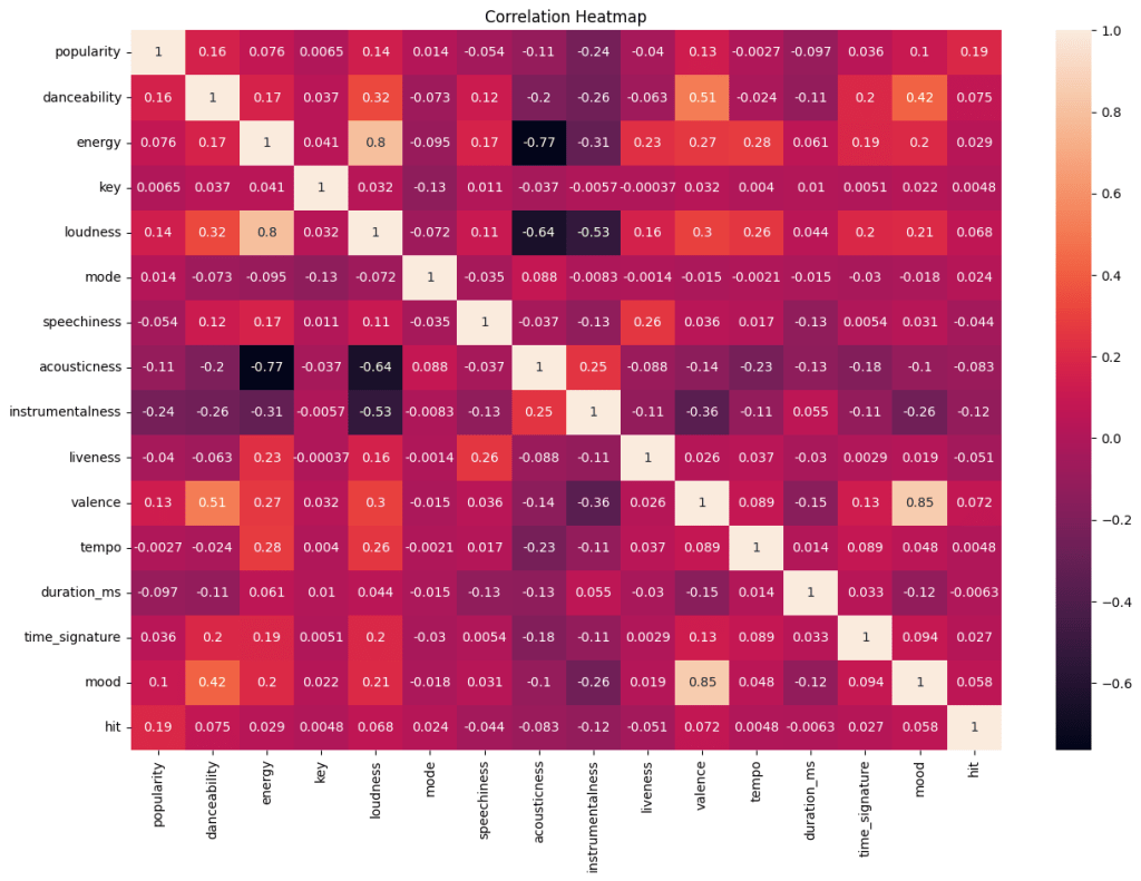
This correlation heatmap shows the correlation between each variable. Acousticness and energy have the strongest negative correlation which is -0.77, followed by the relationship between acousticness and loudness with -0.64. However, the highest positive correlation is 0.85 which is the relationship between mood and valence, followed by the correlation between loudness and energy with 0.80.
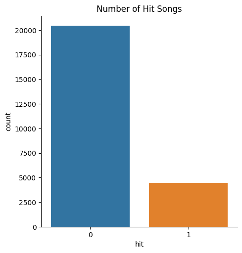
The bar chart above displays that the majority of songs are not on the Billboard chart. The number of non-hit songs is above 20,000. However, there are less than 5,000 songs on the data are hit songs. To conclude, there are not a lot of songs on the Billboard chart.
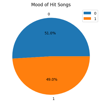
From the pie chart, more than half of the hit songs have positive feelings and approximately 49% of hit songs have negative feelings. This shows that there is not a big difference between the mood of each hit song.
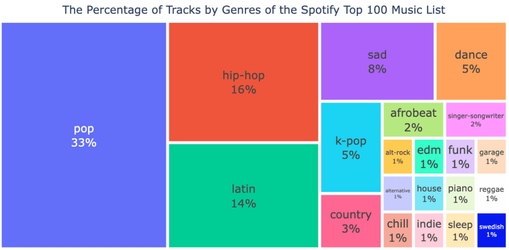
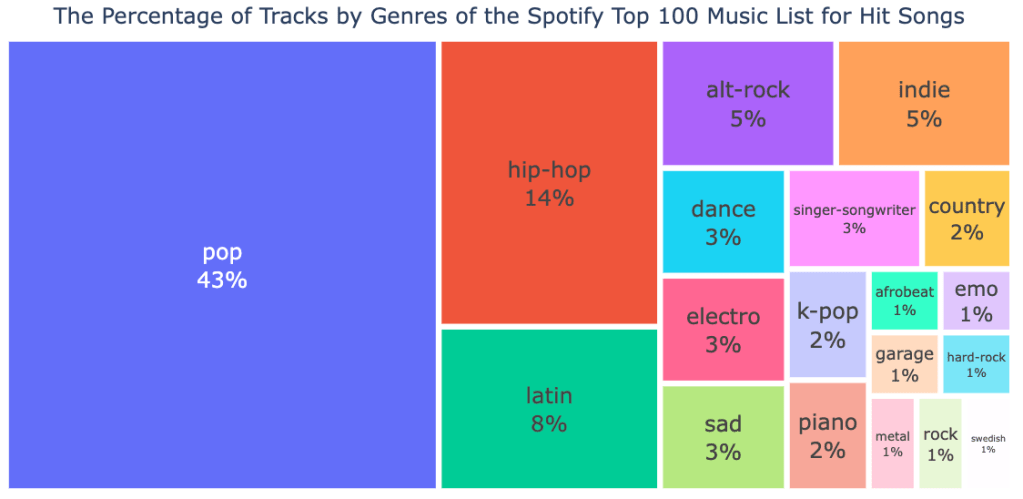
From these treemaps above, they show the percentage of tracks by genres of the Spotify top 100 music list for overall songs and hit songs. The points that are similar in these two figures are pop music is the highest percentage among these songs with 33% for overall songs and 43% for hit songs. In the general music list on Spotify, the genre is followed by latin and hip-hop respectively. However, for hit songs, it is followed by hip-hop and latin music respectively.
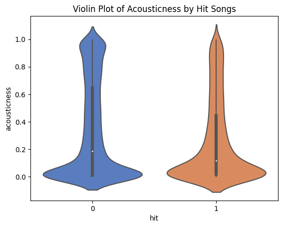
The violin plot above shows how the distributions of the acousticness by hit songs look like. It shows that non-hit songs have a higher median than hit songs. Also, the position of quartile 3 of non-hit songs is higher than hit songs, which means many of the non-hit songs are more acoustic and have a slower rhythm. Conversely, hit songs are more likely to have a fun rhythm.
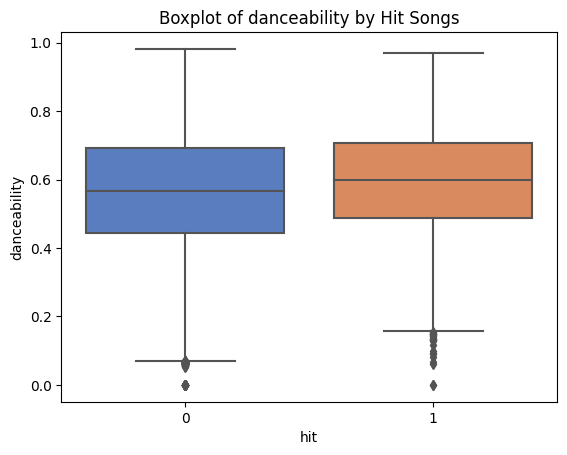
The plot above presents the boxplot of danceability by hit songs. The higher the value of this variable, the easier it is to dance the song. This shows that the hit songs have a beat which is slightly easier to dance to compared to the non-hit songs. However, the median showing on the hit songs is not that much higher than the non-hit songs.
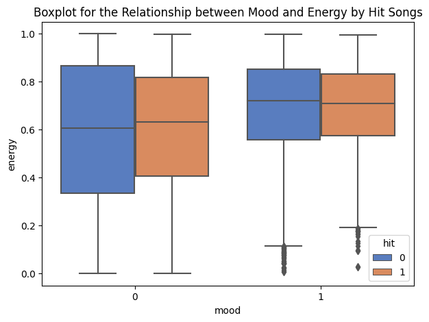
The boxplot above shows the relationship between mood and energy in hit songs. What is interesting to notice is that the hit songs’ median for a negative mood has more energy value than the non-hit songs. In a positive mood, the medians of hit and non-hit songs are almost the same. It could be said that the median of the non-hit songs is slightly higher than the hit songs.
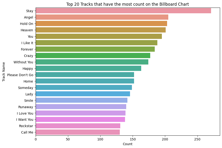
This bar chart above shows the top 20 tracks that have the most count on the Billboard chart. This means that these songs appeared on the charts in the greatest number. It shows that the song named Stay has the highest number of appearing on the charts more than 250 times, followed by the songs named Angel and Hold On respectively.
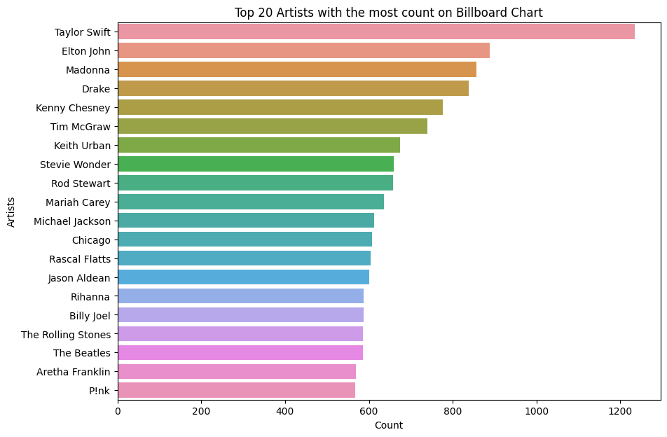
The bar chart above is about the top 20 artists appearing on the Billboard charts. Taylor Swift is the artist who has the highest number of appearances on the charts significantly. More than 1200 times that her name is on the charts. This is followed by Elton John and Madonna with almost 900 appearances for these two artists.
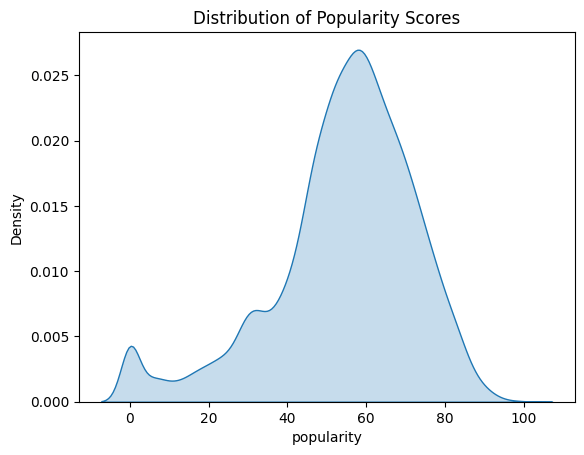
As seen in this plot, the distribution of popularity scores displays that many song lists on Spotify have approximately 60 scores for popularity. This means that the majority of songs that are produced are mostly well-known and heard by quite a lot of people. But there are still some songs with 0 popularity scores on Spotify because barely anyone listens to them.
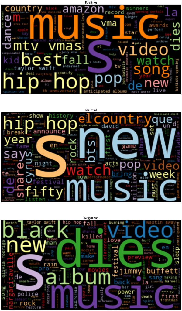
Word Cloud visuals are great representations of text data. They show the most commonly appearing words in a collection of documents. This word cloud shows that language used can vary significantly based on which news outlets the writing comes from.
From word cloud figures, they have positive, neutral, and negative figures. They generated the posts that were collected using the NewsAPI. In a positive figure, it shows that it is related to Taylor Swift, hip hop, pop, and amazon. In a neutral figure, it is related to hip hop, country, and new. However, in a negative figure, it is related to black, dies, and video.
Code
Spotify API
NewsAPI
Data Cleaning and EDAs
NewsAPI Cleaning
Data
